
Colors That Start With H: A Comprehensive Guide to H-Colors
Understanding the nuances of color vocabulary in English goes beyond simple recognition; it enhances descriptive writing, improves communication, and deepens aesthetic appreciation. This article focuses on colors that start with the letter “H,” exploring their definitions, origins, and usage.
Whether you are a student, writer, designer, or simply someone who enjoys language, this guide will provide a comprehensive overview of “H-colors,” enriching your vocabulary and understanding of color terminology.
150 Colors (Names, Hex, RGB, CMYK & Visuals) Starting With H
| No. | Visual | Name | Hex | RGB | CMYK |
| 1 | 🌑 | Haast Shale | #515664 | 81, 86, 100 | 19, 14, 0, 61 |
| 2 | 🌕 | Hacienda | #98811B | 152, 129, 27 | 0, 15, 82, 40 |
| 3 | 🟤 | Hairy Heath | #6B2A14 | 107, 42, 20 | 0, 61, 81, 58 |
| 4 | 🌌 | Haiti | #1B1035 | 27, 16, 53 | 49, 70, 0, 79 |
| 5 | 🟣 | Halaya Ube | #663854 | 102, 56, 84 | 0, 45, 18, 60 |
| 6 | 🥛 | Half and Half | #FFFEE1 | 255, 254, 225 | 0, 0, 12, 0 |
| 7 | 🌊 | Half Baked | #558F93 | 85, 143, 147 | 42, 3, 0, 42 |
| 8 | 💎 | Half Baked Blue | #85C4CC | 133, 196, 204 | 35, 4, 0, 20 |
| 9 | ⚪ | Half Colonial White | #FDF6D3 | 253, 246, 211 | 0, 3, 17, 1 |
| 10 | 🟡 | Half Dutch White | #FEF7DE | 254, 247, 222 | 0, 3, 13, 0 |
| 11 | 🏼 | Half Pearl Lusta | #F1EAD7 | 241, 234, 215 | 0, 3, 11, 5 |
| 12 | 🌫️ | Half Sea Fog | #EFEEE7 | 239, 238, 231 | 0, 0, 3, 6 |
| 13 | 🏽 | Half Spanish | #E6DBC7 | 230, 219, 199 | 0, 5, 13, 10 |
| 14 | 🍦 | Half Spanish White | #FEF4DB | 254, 244, 219 | 0, 4, 14, 0 |
| 15 | 🧉 | Half Tea | #CEC6B5 | 206, 198, 181 | 0, 4, 12, 19 |
| 16 | 🍈 | Hami | #F5C280 | 245, 194, 128 | 0, 21, 48, 4 |
| 17 | 🦈 | Hammerhead | #515769 | 81, 87, 105 | 23, 17, 0, 59 |
| 18 | 🌿 | Hampshire | #598527 | 89, 133, 39 | 33, 0, 71, 48 |
| 19 | 📜 | Hampton | #E5D8AF | 229, 216, 175 | 0, 6, 24, 10 |
| 20 | 🔵 | Han Blue | #446CCF | 68, 108, 207 | 67, 48, 0, 19 |
| 21 | 🎆 | Han Purple | #5218FA | 85, 24, 250 | 67, 90, 0, 2 |
| 22 | ☀️ | Hansa Yellow | #E9D66B | 233, 214, 107 | 0, 8, 54, 9 |
| 23 | 🍹 | Happy Hour | #A9C949 | 169, 201, 73 | 16, 0, 64, 21 |
| 24 | 🟢 | Harlequin | #3FFF00 | 63, 255, 0 | 75, 0, 100, 0 |
| 25 | 🌲 | Harlequin Green | #46CB18 | 70, 203, 24 | 66, 0, 88, 20 |
| 26 | 🍇 | Harlequin Purple | #6A3968 | 106, 57, 104 | 0, 46, 2, 58 |
| 27 | 🕊️ | Harp | #E6F2EA | 230, 242, 234 | 5, 0, 3, 5 |
| 28 | 🎻 | Harp Strings | #CBCEC0 | 203, 206, 192 | 1, 0, 7, 19 |
| 29 | 🔴 | Harvard Crimson | #C90016 | 201, 0, 22 | 0, 100, 89, 21 |
| 30 | 🌾 | Harvest Gold | #DA9100 | 218, 145, 0 | 0, 33, 100, 15 |
| 31 | 🍑 | Harvest Gold Flesh | #EAB76A | 234, 183, 106 | 0, 22, 55, 8 |
| 32 | 🏽 | Hathaway | #F7DE94 | 247, 222, 148 | 0, 10, 40, 3 |
| 33 | 🌲 | Hauraki | #3A4D49 | 58, 77, 73 | 25, 0, 5, 70 |
| 34 | 🍃 | Hauser Green | #607C42 | 96, 124, 66 | 23, 0, 47, 51 |
| 35 | ⬛ | Havana | #3B2B2C | 59, 43, 44 | 0, 27, 25, 77 |
| 36 | 💠 | Havelock Blue | #5590D9 | 85, 144, 217 | 61, 34, 0, 15 |
| 37 | 🛑 | Havoc | #AD3539 | 173, 53, 57 | 0, 69, 67, 32 |
| 38 | 🏾 | Hawaiian Tan | #9D5616 | 157, 86, 22 | 0, 45, 86, 38 |
| 39 | ❄️ | Hawkes Blue | #D4E2FC | 212, 226, 252 | 16, 10, 0, 1 |
| 40 | 🍎 | Hawthorn | #F7060D | 247, 6, 13 | 0, 98, 95, 3 |
| 41 | 🧺 | Haystack | #DEC7A1 | 222, 199, 161 | 0, 10, 27, 13 |
| 42 | 🧱 | Hazard | #A3532A | 163, 83, 42 | 0, 49, 74, 36 |
| 43 | 🏼 | Hazel | #ECC0A1 | 236, 192, 161 | 0, 19, 32, 7 |
| 44 | 🥜 | Hazelnut | #D4893B | 212, 137, 59 | 0, 35, 72, 17 |
| 45 | 🌂 | Hazy Lavender | #B3B0C7 | 179, 176, 199 | 10, 12, 0, 22 |
| 46 | 👚 | Healther | #9E7BB5 | 158, 123, 181 | 13, 32, 0, 29 |
| 47 | 🩸 | Heartbeat | #B12B28 | 177, 43, 40 | 0, 76, 77, 31 |
| 48 | 🔥 | Hearth | #5F4230 | 95, 66, 48 | 0, 31, 49, 63 |
| 49 | 🟠 | Heat Wave | #FF7A00 | 255, 122, 0 | 0, 52, 100, 0 |
| 50 | 🔘 | Heathered Gray | #B7B9B9 | 183, 185, 185 | 1, 0, 0, 27 |
| 51 | 🌑 | Heavy Metal | #2B3228 | 43, 50, 40 | 14, 0, 20, 80 |
| 52 | 🦔 | Hedgehog | #6F4E37 | 111, 78, 55 | 0, 30, 50, 56 |
| 53 | 🏛️ | Heidelberg | #303D5B | 48, 61, 91 | 47, 33, 0, 64 |
| 54 | 🎈 | Helium | #D8D9C8 | 216, 217, 200 | 0, 0, 8, 15 |
| 55 | 🌸 | Heliotrope | #DF73FF | 223, 115, 255 | 13, 55, 0, 0 |
| 56 | 🌋 | Hellfire | #E25822 | 226, 88, 34 | 0, 61, 85, 11 |
| 57 | 🪨 | Hematite | #6D2114 | 109, 33, 20 | 0, 70, 82, 57 |
| 58 | 🧪 | Hemlock | #5E5D3B | 94, 93, 59 | 0, 1, 37, 63 |
| 59 | 🧶 | Hemp | #907874 | 144, 120, 116 | 0, 17, 19, 44 |
| 60 | 🌿 | Herbal | #427452 | 66, 116, 82 | 43, 0, 29, 55 |
| 61 | 🏚️ | Heritage Brick | #7A4138 | 122, 65, 56 | 0, 47, 54, 52 |
| 62 | ⛪ | Hermitage | #B1B9B4 | 177, 185, 180 | 4, 0, 3, 27 |
| 63 | 🛡️ | Hero | #D37C39 | 211, 124, 57 | 0, 41, 73, 17 |
| 64 | 🐦 | Heron | #4C596A | 76, 89, 106 | 28, 16, 0, 58 |
| 65 | 🤡 | Hi Jinx | #E57F3D | 229, 127, 61 | 0, 45, 73, 10 |
| 66 | 🍨 | Hi Lite Flesh | #FEE7E1 | 254, 231, 225 | 0, 9, 11, 0 |
| 67 | 🌺 | Hibiscus | #B6316C | 182, 49, 108 | 0, 73, 41, 29 |
| 68 | 🪵 | Hickory | #433129 | 67, 49, 41 | 0, 27, 39, 74 |
| 69 | 🌵 | High Desert | #D9C3A5 | 217, 195, 165 | 0, 10, 24, 15 |
| 70 | 🏊 | High Dive | #43A1D0 | 67, 161, 208 | 68, 23, 0, 18 |
| 71 | 🚜 | High Grass | #6B8E23 | 107, 142, 35 | 25, 0, 75, 44 |
| 72 | 🥂 | High Life | #E7C650 | 231, 198, 80 | 0, 14, 65, 9 |
| 73 | ☀️ | High Noon | #FFD100 | 255, 209, 0 | 0, 18, 100, 0 |
| 74 | 🏜️ | High Plains | #8B864E | 139, 134, 78 | 0, 4, 44, 45 |
| 75 | ⚓ | High Seas | #1C2E4A | 28, 46, 74 | 62, 38, 0, 71 |
| 76 | 👑 | High Society | #4B2D5E | 75, 45, 94 | 20, 52, 0, 63 |
| 77 | ⚡ | High Voltage | #00A6E1 | 0, 166, 225 | 100, 26, 0, 12 |
| 78 | 🏔️ | Highland | #6F8E63 | 111, 142, 99 | 22, 0, 30, 44 |
| 79 | 🌫️ | Highland Mist | #CBC9D4 | 203, 201, 212 | 4, 5, 0, 17 |
| 80 | 🖊️ | Highlight | #FFFF00 | 255, 255, 0 | 0, 0, 100, 0 |
| 81 | 🎾 | Highstrung | #DA4C33 | 218, 76, 51 | 0, 65, 77, 15 |
| 82 | 🏔️ | Himalaya | #6A5D1B | 106, 93, 27 | 0, 12, 75, 58 |
| 83 | 🛑 | Hinder | #44494E | 68, 73, 78 | 13, 6, 0, 69 |
| 84 | 🍵 | Hint of Green | #E6FFE6 | 230, 255, 230 | 10, 0, 10, 0 |
| 85 | ☁️ | Hint of Grey | #F2F2F2 | 242, 242, 242 | 0, 0, 0, 5 |
| 86 | 🌸 | Hint of Pink | #F1E4E1 | 241, 228, 225 | 0, 5, 7, 5 |
| 87 | 🕯️ | Hint of Red | #FBF9F9 | 251, 249, 249 | 0, 1, 1, 2 |
| 88 | 🍦 | Hint of Yellow | #FAFDE4 | 250, 253, 228 | 1, 0, 10, 1 |
| 89 | 🎧 | Hip Hop | #2A2551 | 42, 37, 81 | 48, 54, 0, 68 |
| 90 | ☮️ | Hippie Blue | #589AAF | 88, 154, 175 | 50, 12, 0, 31 |
| 91 | 🥦 | Hippie Green | #53824B | 83, 130, 75 | 36, 0, 42, 49 |
| 92 | 🕺 | Hippie Pink | #AE4560 | 174, 69, 96 | 0, 60, 45, 32 |
| 93 | 🦛 | Hippo | #967C69 | 150, 124, 105 | 0, 17, 30, 41 |
| 94 | 🐘 | Hippo Grey | #677564 | 103, 117, 100 | 12, 0, 15, 54 |
| 95 | 👅 | Hippo Red | #DB778E | 219, 119, 142 | 0, 46, 35, 14 |
| 96 | 💿 | Hit Gray | #A1ADB5 | 161, 173, 181 | 11, 4, 0, 29 |
| 97 | 🍑 | Hit Pink | #FFAB81 | 255, 171, 129 | 0, 33, 49, 0 |
| 98 | 🛣️ | Hitchhiker | #D0C7A8 | 208, 199, 168 | 0, 4, 19, 18 |
| 99 | 💃 | Hokey Pokey | #C8A528 | 200, 165, 40 | 0, 17, 80, 22 |
| 100 | 🏅 | Hokey Pokey Gold | #BB8E34 | 187, 142, 52 | 0, 24, 72, 27 |
| 101 | 🌥️ | Hoki | #658695 | 101, 134, 149 | 32, 10, 0, 42 |
| 102 | 🌲 | Holly | #011E12 | 1, 30, 18 | 97, 0, 40, 88 |
| 103 | 🎬 | Hollywood | #F400A1 | 244, 0, 161 | 0, 100, 34, 4 |
| 104 | 👗 | Hollywood Cerise | #D40073 | 212, 0, 115 | 0, 100, 46, 17 |
| 105 | 🐄 | Holstein | #F5F5F5 | 245, 245, 245 | 0, 0, 0, 4 |
| 106 | 🧪 | Holy Moly | #828627 | 130, 134, 39 | 3, 0, 71, 47 |
| 107 | 🎖️ | Homage | #303741 | 48, 55, 65 | 26, 15, 0, 75 |
| 108 | ⚾ | Home Run | #008151 | 0, 129, 81 | 100, 0, 37, 49 |
| 109 | 🍯 | Honey | #FFBD31 | 255, 189, 49 | 0, 26, 81, 0 |
| 110 | 🧸 | Honey Bear | #BA9261 | 186, 146, 97 | 0, 22, 48, 27 |
| 111 | 🥞 | Honey Cream | #FBF1C3 | 251, 241, 195 | 0, 4, 22, 2 |
| 112 | 🍇 | Honey Flower | #4F1C70 | 79, 28, 112 | 29, 75, 0, 56 |
| 113 | 🕯️ | Honey Glow | #E8B446 | 232, 180, 70 | 0, 22, 70, 9 |
| 114 | 🍈 | Honeydew | #F0FFF0 | 240, 255, 240 | 6, 0, 6, 0 |
| 115 | 🌸 | Honeysuckle | #EDFC84 | 237, 252, 132 | 6, 0, 48, 1 |
| 116 | 🏙️ | Hong Kong | #8B9095 | 139, 144, 149 | 7, 3, 0, 42 |
| 117 | 🌊 | Honolulu Blue | #006DB0 | 0, 109, 176 | 100, 38, 0, 31 |
| 118 | 🌳 | Hooker’s Green | #007000 | 0, 112, 0 | 100, 0, 100, 56 |
| 119 | 🌸 | Hop Bush | #D06DA1 | 208, 109, 161 | 0, 48, 23, 18 |
| 120 | 🪀 | Hopskotch | #CD6D93 | 205, 109, 147 | 0, 47, 28, 20 |
| 121 | 🌅 | Horizon | #5A87A0 | 90, 135, 160 | 44, 16, 0, 37 |
| 122 | 🔮 | Horoscope | #43373A | 67, 55, 58 | 0, 18, 13, 74 |
| 123 | ⬛ | Horse Black | #190F0F | 25, 15, 15 | 0, 40, 40, 90 |
| 124 | 🐎 | Horse Brown | #834C2D | 131, 76, 45 | 0, 42, 66, 49 |
| 125 | ⬜ | Horse White | #DEDEDE | 222, 222, 222 | 0, 0, 0, 13 |
| 126 | 🟤 | Horse’s Neck | #604913 | 96, 73, 19 | 0, 24, 80, 62 |
| 127 | 🏜️ | Hot August | #745142 | 116, 81, 66 | 0, 30, 43, 55 |
| 128 | 🌶️ | Hot Chili | #A42115 | 164, 33, 21 | 0, 80, 87, 36 |
| 129 | 🥨 | Hot Cinnamon | #D2691E | 210, 105, 30 | 0, 50, 86, 18 |
| 130 | 🍛 | Hot Curry | #815B28 | 129, 91, 40 | 0, 29, 69, 49 |
| 131 | 💗 | Hot Pink | #FF69B4 | 255, 105, 180 | 0, 59, 29, 0 |
| 132 | 🥃 | Hot Toddy | #B38007 | 179, 128, 7 | 0, 28, 96, 30 |
| 133 | 🏨 | Hotel | #A1998B | 161, 153, 139 | 0, 5, 14, 37 |
| 134 | 🏛️ | House White | #E9E6DC | 233, 230, 220 | 0, 1, 6, 9 |
| 135 | 🪨 | Howlite | #E6E6E6 | 230, 230, 230 | 0, 0, 0, 10 |
| 136 | 🌴 | Hula Girl | #FF7034 | 255, 112, 52 | 0, 56, 80, 0 |
| 137 | 🦜 | Hummingbird | #7FE1D1 | 127, 225, 209 | 44, 0, 7, 12 |
| 138 | 🧆 | Hummus | #EEDD99 | 238, 221, 153 | 0, 7, 36, 7 |
| 139 | 🌲 | Hunter Green | #355E3B | 53, 94, 59 | 44, 0, 37, 63 |
| 140 | 🌪️ | Hurricane | #87797A | 135, 121, 122 | 0, 10, 10, 47 |
| 141 | 🌽 | Husk | #B7A458 | 183, 164, 88 | 0, 10, 52, 28 |
| 142 | 💐 | Hyacinth | #9370DB | 147, 112, 219 | 33, 49, 0, 14 |
| 143 | 🔴 | Hyacinth Red | #A8211B | 168, 33, 27 | 0, 80, 84, 34 |
| 144 | 🏖️ | Hyam’s Beach | #F0EEF1 | 240, 238, 241 | 0, 1, 0, 5 |
| 145 | 💧 | Hydrangea | #5896CD | 88, 150, 205 | 57, 27, 0, 20 |
| 146 | 🏃 | Hyperactive | #E36C36 | 227, 108, 54 | 0, 52, 76, 11 |
| 147 | 🌀 | Hypnotic | #D1E182 | 209, 225, 130 | 7, 0, 42, 12 |
| 148 | 😵 | Hysteria | #6C448E | 108, 68, 142 | 24, 52, 0, 44 |
| 149 | 🥗 | Honeydew Green | #D0F0C0 | 208, 240, 192 | 13, 0, 20, 6 |
| 150 | ⛈️ | Heavy Sky | #4C596A | 76, 89, 106 | 28, 16, 0, 58 |
Table of Contents
- Introduction
- Definition of Colors Starting with H
- Most Popular Colors That Start With H and What They Are Used For
- Structural Breakdown of Color Names
- Types and Categories of H-Colors
- Examples of H-Colors in Context
- Usage Rules for H-Colors
- Common Mistakes When Using H-Colors
- Practice Exercises
- Advanced Topics in Color Terminology
- Frequently Asked Questions (FAQ)
- Conclusion
Definition of Colors Starting with H
Colors starting with “H” encompass a variety of shades and hues, each with its own unique characteristics and origins. These colors range from vibrant and bold to subtle and muted, offering a diverse palette for artistic expression and descriptive language.
Understanding these colors involves not only knowing their names but also appreciating their visual qualities and the contexts in which they are used.
Here’s a breakdown of some common and less common colors that begin with “H”:
- Harlequin: A color pattern characterized by diamond-shaped patches of alternating colors, often very bright and contrasting. It’s more about a pattern than a specific hue.
- Heliotrope: A light purple or mauve color, named after the heliotrope flower.
- Honey: A warm, golden-yellow color reminiscent of honey.
- Honeydew: A pale tint of green, resembling the flesh of a honeydew melon.
- Hooker’s Green: A dark, muted green, traditionally made from Prussian blue and gamboge.
Classification of H-Colors
Classifying colors involves understanding their relationship to the color wheel and their perceptual qualities. H-colors can be classified based on their hue, saturation, and brightness.
Hue refers to the pure color, such as purple, yellow, or green. Saturation describes the intensity or purity of the color. Brightness, also known as value or lightness, refers to how light or dark the color appears.
Function of H-Colors
Colors serve various functions in communication, art, and design. They can evoke emotions, create visual interest, convey symbolic meanings, and provide important information. For example, Honey might be used to convey warmth and sweetness, while Heliotrope could suggest elegance and sophistication.
Contexts of H-Colors
The context in which a color is used significantly affects its interpretation. In art, colors are chosen deliberately to create specific effects.
In design, colors are used to enhance usability and appeal. In everyday language, colors help us describe and differentiate objects and experiences.
For instance, a “harlequin” pattern might be used in a circus or theatrical setting, while “honeydew” is more likely to describe a paint color or the fruit itself.
Most Popular Colors That Start With H and What They Are Used For
Colors that start with H cover a wide range of shades — from bold and energetic to soft and timeless. Some of these colors are so widely recognized that they appear in fashion, interior design, branding, art, and everyday life. Below are the most popular H colors and what they are commonly used for.
Hot Pink
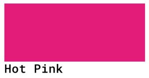
Hot Pink is one of the boldest and most energetic colors that start with H. It sits between a vivid red and a bright magenta, making it impossible to ignore. In fashion, Hot Pink has been a runway favorite for decades, worn by icons and designers who want to make a strong visual statement. In advertising and marketing, brands use Hot Pink to grab attention quickly and communicate excitement, confidence, and youthfulness. It is also widely used in event decoration, party supplies, and beauty products. Hot Pink works well with black, white, and navy blue, creating high-contrast combinations that feel modern and powerful.
Hunter Green

Hunter Green is a deep, rich shade of green that feels both classic and sophisticated. It takes its name from the color traditionally worn by hunters in the field, blending naturally with forests and landscapes. Today, Hunter Green is one of the most popular choices in interior design, used on walls, furniture, and cabinetry to bring a sense of calm, nature, and elegance into a space. In fashion, it appears in coats, blazers, and accessories as a versatile alternative to black or navy. Luxury brands frequently use Hunter Green in packaging and branding because it communicates quality and trust. It pairs beautifully with gold, cream, and warm wood tones.
Honeydew

Honeydew is a very pale, almost white shade of green named after the light inner flesh of the honeydew melon. It is one of the softest and most calming colors that start with H, making it a popular choice in home décor, nursery design, and minimalist interiors. Designers use Honeydew when they want to add a subtle hint of color without overwhelming a space. It is also commonly used as a background color in web design and packaging, where a clean, fresh look is needed. Honeydew pairs effortlessly with white, soft gray, and pastel tones, creating an airy and peaceful atmosphere.
Heliotrope
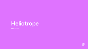
Heliotrope is a striking purple-pink color named after the heliotrope flower, which blooms in vivid shades of violet and magenta. It sits between purple and pink on the color spectrum, giving it a unique, eye-catching quality that feels both feminine and artistic. In cosmetics and beauty, Heliotrope is a popular choice for eyeshadow, nail polish, and lip color because of its rich, jewel-like appearance. Graphic designers and artists use Heliotrope in bold branding, album covers, and digital art when they want a color that feels luxurious and creative. It pairs well with gold, deep navy, and soft lavender.
Harvest Gold
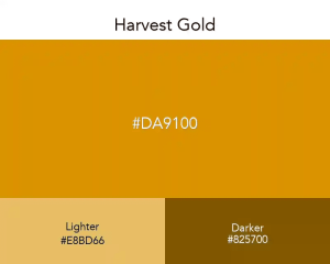
Harvest Gold is a warm, earthy shade of golden yellow that evokes the colors of autumn fields, ripe grains, and falling leaves. It was especially popular in interior design and home appliances during the 1970s and has seen a strong revival in modern bohemian and rustic décor styles. In seasonal marketing and packaging, Harvest Gold is widely used for autumn campaigns, Thanksgiving themes, and harvest festivals because it instantly communicates warmth and abundance. Fashion designers use it in knitwear, scarves, and outerwear to reflect the cozy feeling of the fall season. Harvest Gold pairs well with burnt orange, deep brown, olive green, and cream.
Havelock Blue
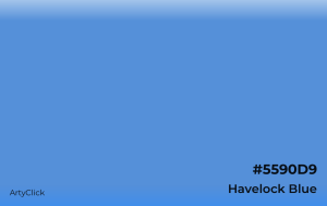
Havelock Blue is a medium, muted shade of blue with a slight gray undertone, giving it a calm and understated appearance. It is widely used in interior design for bedrooms and living rooms where a relaxing, coastal atmosphere is desired. Graphic designers often reach for Havelock Blue when creating corporate materials, healthcare branding, or educational content, as it communicates reliability and professionalism without being as formal as navy or as bright as royal blue. In fashion, it appears in casual and workwear collections as a versatile, easy-to-style neutral blue. It pairs well with white, sand, soft beige, and warm wood tones.
Hibiscus

Hibiscus is a vivid, deep pink-red color inspired by the tropical hibiscus flower. It carries strong associations with warmth, celebration, and tropical beauty, making it a popular color in summer fashion, resort wear, and travel branding. In graphic design, Hibiscus is used to create energy and visual excitement, especially in food and beverage branding for tropical drinks, juices, and exotic products. It is also a popular choice in floral-themed home décor and textile design. Hibiscus pairs well with bright white, leafy green, coral, and golden yellow, creating combinations that feel fresh, lively, and full of life.
Structural Breakdown of Color Names
The structure of color names often reveals information about their origin, composition, or appearance. Many color names are derived from natural objects, historical figures, or artistic processes.
Understanding the structure of these names can provide insight into their meaning and usage.
Let’s examine the structural components of some H-colors:
- Heliotrope: This name comes from the Greek words helios (sun) and tropos (turn), referring to the flower’s tendency to turn towards the sun.
- Honey: This is a straightforward name, derived directly from the sweet substance produced by bees.
- Honeydew: This name combines “honey” with “dew,” suggesting a sweet, refreshing, and light color.
- Hooker’s Green: This color is named after the botanical artist William Hooker, who popularized its use. The name reflects its historical origin and association with a specific individual.
Etymology of Color Names
The etymology of color names provides a deeper understanding of their historical and cultural significance. By tracing the origins of these names, we can uncover fascinating stories and connections to various fields of knowledge.
For example, the name “heliotrope” not only describes the color but also alludes to the plant’s unique behavior. This connection between the color and its namesake enriches our appreciation of both.
Morphology of Color Names
The morphology of color names involves analyzing their structure and components. Compound color names like “honeydew” are formed by combining two or more words to create a new meaning.
Understanding these morphological patterns can help us decipher the meanings of unfamiliar color names.
Types and Categories of H-Colors
H-colors can be categorized based on various criteria, including their hue, saturation, brightness, and origin. These categories provide a framework for understanding the relationships between different colors and their characteristics.
Hue-Based Categories
Hue-based categories classify colors according to their position on the color wheel. H-colors can be broadly categorized as follows:
- Purple/Mauve: Heliotrope
- Yellow: Honey
- Green: Honeydew, Hooker’s Green
Saturation-Based Categories
Saturation refers to the intensity or purity of a color. High-saturation colors are vivid and intense, while low-saturation colors are muted and dull.
- High Saturation: Harlequin (when the pattern includes bright colors)
- Medium Saturation: Honey
- Low Saturation: Heliotrope, Honeydew, Hooker’s Green
Brightness-Based Categories
Brightness, also known as value or lightness, refers to how light or dark a color appears.
- High Brightness: Honeydew
- Medium Brightness: Heliotrope, Honey
- Low Brightness: Hooker’s Green
Examples of H-Colors in Context
Understanding how H-colors are used in various contexts can enhance your ability to describe and appreciate them. Here are several examples of H-colors in different situations:
Examples in Literature
Authors often use color to create vivid imagery and evoke emotions in their readers. The following table provides examples of H-colors used in literary contexts:
| Sentence | Color | Context |
|---|---|---|
| The garden was filled with heliotrope blooms, their sweet fragrance filling the air. | Heliotrope | Describing a garden scene |
| The honey-colored sunlight streamed through the window, warming the room. | Honey | Describing light and atmosphere |
| Her dress was a delicate honeydew green, perfectly complementing her fair skin. | Honeydew | Describing a person’s appearance |
| The artist used Hooker’s Green to create depth and shadow in the landscape painting. | Hooker’s Green | Describing an artistic technique |
| The clown’s costume featured a harlequin pattern of red, yellow, and blue diamonds. | Harlequin | Describing a costume |
| She painted the walls a soft heliotrope to create a calming effect in the bedroom. | Heliotrope | Interior design description |
| The honey glaze on the pastries gave them a tempting golden hue. | Honey | Describing food |
| The nursery was painted a gentle honeydew to create a soothing environment for the baby. | Honeydew | Describing interior design |
| He favored Hooker’s Green for the foliage in his watercolor paintings. | Hooker’s Green | Describing artistic preference |
| The jester’s hat was a vibrant harlequin design, catching everyone’s eye. | Harlequin | Describing clothing |
| The bride chose heliotrope as the accent color for her wedding. | Heliotrope | Describing wedding decor |
| A jar of honey sat on the table, its golden color gleaming in the light. | Honey | Describing a household item |
| Light honeydew curtains filtered the morning sun. | Honeydew | Describing home decor |
| The artist mixed Hooker’s Green to achieve the precise shade of the forest canopy. | Hooker’s Green | Describing artistic process |
| The harlequin tiles added a playful element to the kitchen floor. | Harlequin | Describing interior design |
| The sunset cast a heliotrope glow across the sky. | Heliotrope | Describing a natural phenomenon |
| The honey-sweet aroma of the flowers filled the air. | Honey | Describing a scent |
| She chose a honeydew-colored scarf to wear with her outfit. | Honeydew | Describing clothing |
| Hooker’s Green provided the perfect contrast to the brighter colors in the painting. | Hooker’s Green | Describing artistic composition |
| The stage was set with a harlequin backdrop for the performance. | Harlequin | Describing stage design |
| The faint heliotrope tint of the twilight sky signaled the end of the day. | Heliotrope | Describing twilight |
| The honey infused tea had a distinctive golden hue. | Honey | Describing tea |
| The walls were painted a soothing honeydew shade. | Honeydew | Describing interior design |
| He used Hooker’s Green to capture the deep shadows of the forest. | Hooker’s Green | Describing artistic technique |
Examples in Design
Designers use color strategically to create visually appealing and functional products. The following table provides examples of H-colors used in design contexts:
| Context | Color | Description |
|---|---|---|
| Website Design | Honeydew | A honeydew background provides a soft, clean look for a website. |
| Interior Design | Heliotrope | Heliotrope accents add a touch of elegance to a room. |
| Fashion Design | Honey | A honey-colored sweater is a warm and inviting addition to a wardrobe. |
| Graphic Design | Hooker’s Green | Hooker’s Green is used to create a natural and earthy feel in a logo. |
| Product Design | Harlequin | A harlequin pattern makes a product stand out and adds a playful touch. |
| Branding | Heliotrope | The company logo features a sophisticated heliotrope to signal creativity. |
| Web Design | Honey | The website uses a honey-toned palette to evoke a feeling of warmth. |
| Advertising | Honeydew | The advertisement uses a honeydew backdrop to highlight the product. |
| Textiles | Hooker’s Green | The fabric is dyed a deep Hooker’s Green for a rich, natural look. |
| Packaging | Harlequin | The product packaging features a harlequin pattern to catch the consumer’s eye. |
| Logos | Heliotrope | A tech company uses heliotrope to symbolize innovation. |
| User Interface (UI) | Honey | The UI uses honey-colored highlights to guide the user’s attention. |
| Marketing Materials | Honeydew | The brochures feature a soothing honeydew background. |
| Artistic Projects | Hooker’s Green | The designer uses Hooker’s Green to create a vintage aesthetic. |
| Promotional Items | Harlequin | The promotional bag features a harlequin design to draw attention. |
| Brand Identity | Heliotrope | The brand uses a signature heliotrope in all its communications. |
| Social Media Graphics | Honey | The social media posts feature a honey-toned filter. |
| Print Design | Honeydew | The print magazine uses a honeydew border. |
| Digital Art | Hooker’s Green | The digital painting uses Hooker’s Green to create depth. |
| Visual Merchandising | Harlequin | The store display features a harlequin arrangement of products. |
| Infographics | Heliotrope | The infographic uses heliotrope to highlight key data points. |
| Email Marketing | Honey | The email template uses a honey-colored header. |
| Presentation Slides | Honeydew | The presentation slides use a honeydew background. |
| Web Banners | Hooker’s Green | The web banner features Hooker’s Green accents. |
Examples in Everyday Language
Colors are frequently used in everyday language to describe objects, experiences, and emotions. The following table provides examples of H-colors used in everyday conversation:
| Sentence | Color | Context |
|---|---|---|
| She painted her bedroom walls heliotrope. | Heliotrope | Describing home decor |
| The honey was locally sourced and tasted amazing. | Honey | Describing food |
| The baby’s room was decorated in a calming honeydew green. | Honeydew | Describing a room’s color |
| He always used Hooker’s Green for the trees in his paintings. | Hooker’s Green | Describing an artistic preference |
| The circus tent was decorated in a vibrant harlequin pattern. | Harlequin | Describing decorations |
| “I love your heliotrope scarf, it really brings out your eyes.” | Heliotrope | Complimenting someone’s attire |
| “This honey cake is the best I’ve ever tasted!” | Honey | Expressing enjoyment of food |
| “We should paint the living room a soft honeydew to make it feel more spacious.” | Honeydew | Suggesting a decorating idea |
| “For the landscape, I’ll use Hooker’s Green to create a realistic depth.” | Hooker’s Green | Planning an art project |
| “The harlequin design of the quilt added a whimsical touch to the room.” | Harlequin | Describing a decorative item |
| “The artist captured the subtle beauty of the heliotrope blossoms.” | Heliotrope | Discussing a painting |
| “This honey has a rich, floral aroma.” | Honey | Describing the scent of honey |
| “The walls were a pale honeydew, creating a serene atmosphere.” | Honeydew | Describing a room’s ambiance |
| “He used Hooker’s Green to add shadows in the forest scene.” | Hooker’s Green | Discussing painting techniques |
| “The harlequin pattern of the dress made it perfect for the party.” | Harlequin | Describing an outfit |
| “She chose a heliotrope shade for her bridesmaid dresses.” | Heliotrope | Wedding planning |
| “The honey in this tea gives it a unique flavor.” | Honey | Commenting on the taste of tea |
| “We opted for honeydew walls in the nursery to create a peaceful environment.” | Honeydew | Discussing nursery decor |
| “The deep, rich Hooker’s Green made the painting come alive.” | Hooker’s Green | Expressing admiration for a painting |
| “The harlequin pattern of the flag made it easy to spot in the crowd.” | Harlequin | Describing a flag |
Usage Rules for H-Colors
Using H-colors correctly involves understanding their specific meanings and connotations, as well as following general rules of color theory and composition.
General Rules of Color Usage
- Consider Context: The context in which a color is used significantly affects its interpretation.
- Use Color Theory: Understand basic color theory principles, such as complementary colors, analogous colors, and color harmony.
- Be Consistent: Maintain consistency in color usage to create a cohesive and professional look.
Specific Rules for H-Colors
- Heliotrope: Use this color to convey elegance, sophistication, or a sense of nostalgia.
- Honey: Use this color to evoke warmth, sweetness, or a sense of comfort.
- Honeydew: Use this color to create a calming, refreshing, or natural atmosphere.
- Hooker’s Green: Use this color to represent nature, depth, or a vintage aesthetic.
- Harlequin: Use this pattern to add a playful, whimsical, or attention-grabbing element.
Exceptions and Special Cases
There are always exceptions to the rules, and color usage is often a matter of personal preference and artistic expression. However, it’s important to be aware of the potential effects of your color choices and to use them intentionally.
For example, while harlequin patterns are often associated with playfulness, they can also be used in more serious or dramatic contexts to create a sense of tension or contrast.
Common Mistakes When Using H-Colors
Even experienced writers and designers can make mistakes when using colors. Here are some common errors to avoid:
| Incorrect | Correct | Explanation |
|---|---|---|
| “The wall was painted a bright heliotrope.” | “The wall was painted a soft heliotrope.” | Heliotrope is typically a soft, muted color. |
| “The lemon had a honey color.” | “The lemon had a yellow color.” | Honey is typically golden-yellow, not the color of a lemon. |
| “The dark forest was honeydew.” | “The meadow was honeydew.” | Honeydew is a light green, not suitable for describing a dark forest. |
| “The sky was painted in Hooker’s Green.” | “The trees were painted in Hooker’s Green.” | Hooker’s Green is typically used for foliage, not the sky. |
| “The formal event was decorated with harlequin patterns.” | “The fun fair was decorated with harlequin patterns.” | Harlequin patterns are more suitable for playful events. |
| “The car was heliotrope, making it stand out.” | “The car was lavender, making it stand out.” | Heliotrope is a more subtle shade, not typically used to make something stand out. |
| “The sunset was honey-colored.” | “The sunset was amber-colored.” | While possible, amber is a more typical color for sunsets. |
| “The winter landscape was honeydew.” | “The spring landscape was honeydew.” | Honeydew evokes spring, not the starkness of winter. |
| “He used Hooker’s Green for the sunny highlights.” | “He used yellow for the sunny highlights.” | Hooker’s Green is better for shadows. |
| “The serious play had a harlequin theme.” | “The comedic play had a harlequin theme.” | Harlequin is more suited for comedic or lighthearted themes. |
Practice Exercises
Test your understanding of H-colors with the following exercises:
- Choose the best color to describe a calming bedroom:
- a) Harlequin
- b) Heliotrope
- c) Honey
- Which color is best used to describe a sweet treat?
- a) Hooker’s Green
- b) Honeydew
- c) Honey
- Which color is most appropriate for describing lush foliage?
- a) Heliotrope
- b) Hooker’s Green
- c) Honeydew
- Which pattern is best for a playful design?
- a) Honeydew
- b) Harlequin
- c) Honey
- Fill in the blank: The walls were painted a light ____ to create a serene atmosphere.
- a) Harlequin
- b) Heliotrope
- c) Honeydew
- Select the sentence that uses color correctly:
- a) The deep sea was painted honeydew.
- b) The meadow was painted honeydew.
- c) The night sky was honeydew.
- What color best describes a vintage aesthetic?
- a) Honey
- b) Hooker’s Green
- c) Heliotrope
- What decorative style is best suited to a harlequin pattern?
- a) Formal
- b) Playful
- c) Somber
- Choose the correct color to describe a flower:
- a) Hooker’s Green
- b) Heliotrope
- c) Honey
- Which color is associated with a refreshing sensation?
- a) Honey
- b) Heliotrope
- c) Honeydew
Answer Key
- b) Heliotrope
- c) Honey
- b) Hooker’s Green
- b) Harlequin
- c) Honeydew
- b) The meadow was painted honeydew.
- b) Hooker’s Green
- b) Playful
- b) Heliotrope
- c) Honeydew
Advanced Topics in Color Terminology
For advanced learners, exploring the nuances of color psychology, color symbolism, and historical color usage can provide a deeper understanding of color terminology.
Color Psychology
Color psychology studies the effects of colors on human emotions and behavior. Different colors can evoke different feelings and associations, and understanding these effects can be valuable in marketing, design, and therapy.
Color Symbolism
Color symbolism explores the cultural and historical meanings associated with different colors. These meanings can vary across cultures and time periods, and understanding them can provide insight into art, literature, and social customs.
Historical Color Usage
The historical usage of colors provides context for understanding their evolution and significance. By examining how colors have been used in art, fashion, and design throughout history, we can gain a deeper appreciation of their cultural impact.
Shade That Starts With H
Finding the perfect word to describe a “shade that starts with H” often leads to a spectrum of sophisticated and evocative colors. Whether you are looking for a specific pigment for design or a poetic descriptor for writing, the letter H offers a surprisingly diverse palette.
The Major Contenders
-
Heliotrope: This is perhaps the most famous “H” shade—a brilliant, pinkish-purple hue named after the flower. It evokes a sense of vintage elegance and creative energy.
-
Hazel: A classic, multi-faceted color typically used to describe eyes. It sits at the intersection of golden-brown and green, representing warmth and natural complexity.
-
Hunter Green: A deep, dark forest green that carries associations with traditional wilderness, sophistication, and timeless masculinity.
-
Harlequin: For those seeking something bold, this is a vivid, neon-like green that is impossible to ignore.
Subtle and Modern Tones
If you are leaning toward neutrals or soft pastels, Heather provides a muted, grayish-purple tone reminiscent of misty highlands. For a touch of luxury, Honey offers a sweet, amber-yellow glow that adds warmth to any palette.
From the electric vibrance of Hot Pink to the industrial coolness of Hematite, shades starting with H cover every mood and atmosphere imaginable.
Frequently Asked Questions (FAQ)
- What is the origin of the name “heliotrope”?The name “heliotrope” comes from the Greek words helios (sun) and tropos (turn), referring to the heliotrope flower’s tendency to turn towards the sun. This connection highlights the flower’s unique behavior and its association with light and warmth.
- How is “Hooker’s Green” traditionally made?“Hooker’s Green” was traditionally made by mixing Prussian blue and gamboge. This combination created a dark, muted green that was popular among botanical artists for its natural and earthy appearance. Modern versions may use different pigments, but the color retains its distinctive character.
- What are some common uses for “honeydew” in design?“Honeydew” is often used in design to create a calming, refreshing, or natural atmosphere. It is a popular choice for backgrounds, accents, and textiles, and it can be used in a variety of contexts, from websites to nurseries.
- Is “harlequin” a specific color, or a pattern?“Harlequin” primarily refers to a pattern consisting of diamond-shaped patches of alternating colors. While the colors used in a harlequin pattern can vary, the pattern itself is the defining characteristic. The pattern is often associated with playfulness and whimsy, making it popular in costumes and decorations.
- What emotions does the color “honey” typically evoke?The color “honey” typically evokes feelings of warmth, sweetness, and comfort. It is associated with natural goodness, nourishment, and a sense of well-being. These associations make it a popular choice for food packaging, home decor, and branding.
- How can I effectively use “heliotrope” in my writing?To effectively use “heliotrope” in your writing, consider its connotations of elegance, sophistication, and nostalgia. Use it to describe objects, scenes, or characters that possess these qualities. For example, you might describe a garden filled with heliotrope blossoms or a character wearing a heliotrope-colored scarf.
- What is the difference between “hue,” “saturation,” and “brightness”?Hue refers to the pure color, such as purple, yellow, or green. Saturation describes the intensity or purity of the color. Brightness, also known as value or lightness, refers to how light or dark the color appears. These three dimensions of color are essential for understanding and describing colors accurately.
- Are there any cultural associations with “Hooker’s Green”?Because “Hooker’s Green” is named after a botanical artist, it is often associated with botanical art, nature, and a traditional aesthetic. It may also evoke a sense of history and craftsmanship, due to its origins in traditional pigment mixing techniques.
- What colors pair well with “honeydew”?“Honeydew” is a versatile color that pairs well with a variety of other colors. It complements other pastel shades, such as lavender and baby blue, and it also works well with neutral colors like white and gray. For a bolder look, it can be paired with contrasting colors like coral or navy blue.
- How can I avoid making mistakes when using color names?To avoid making mistakes when using color names, it’s important to understand their specific meanings and connotations. Consult a color dictionary or online resource to verify the accuracy of your descriptions. Pay attention to the context in which you are using the color, and choose a color that is appropriate for the situation.
Conclusion
Mastering colors that start with “H” enhances your descriptive abilities and enriches your understanding of the English language. From the elegant “heliotrope” to the playful “harlequin,” each color offers unique nuances and applications.
By understanding their definitions, origins, and usage rules, you can effectively incorporate these colors into your writing, design, and everyday communication.
Remember to consider the context, use color theory principles, and be mindful of common mistakes. Continuous practice and exploration will further refine your color vocabulary and appreciation.
Embrace the diverse world of colors, and let your creativity shine!